
Most bad websites are not bad because of the colours or the fonts. They are bad because nobody can find anything. That problem is solved before a single pixel is drawn, and it has a name: information architecture.
This guide is a hands-on walkthrough of information architecture web design work for a real business site. No theory dumps, no UX jargon you will never use again. Just a repeatable process a small business owner or a junior designer can run with a spreadsheet, a stack of index cards and an hour of quiet.
What Information Architecture Actually Means for a Business Website
Information architecture (IA) is the practice of organising, structuring and labelling content so visitors can find what they need without thinking about it. On a business website, that translates into four very concrete decisions:
- What content exists (and what should be deleted)
- How content is grouped into sections and categories
- What each group is called in the menu
- Where each page sits in the hierarchy and at what URL
Notice that none of those decisions involve a design tool. That is the whole point. IA is the skeleton; visual design is the skin. If the skeleton is crooked, no amount of beautiful design will fix it.
IA vs Sitemap vs Navigation: Clearing Up the Confusion
| Term | What it is | Output |
|---|---|---|
| Information architecture | The full system of grouping, labelling and relationships between content | Content inventory, grouping logic, naming rules, hierarchy |
| Sitemap | A visual document that shows the IA as a tree of pages | A diagram or indented list |
| Navigation | The interface that exposes part of the IA to the user | Header menu, footer, breadcrumbs, filters |
Put simply: the IA is the plan, the sitemap is the drawing of the plan, and the navigation is the visible slice of the plan the visitor interacts with. You can have a deep IA with a very simple menu, and that is often the correct answer. Someone has put together a good summary of it.

Why You Should Do This on Paper First
Jumping straight into Figma or a page builder feels productive. It is not. Three reasons to structure first:
- Rework is cheap on paper. Moving a sticky note takes two seconds. Rebuilding a menu, re-exporting twelve page templates and setting up redirects takes a day.
- Structure drives SEO. Your URL hierarchy, internal linking and topical grouping are decided during IA, not during design. Get it wrong and you spend the next two years fighting keyword cannibalisation.
- It forces content decisions. Designers love to design pages that nobody ever writes. A content inventory kills those pages early.
What You Need Before You Start
- A spreadsheet (Google Sheets, Excel, anything)
- Index cards or sticky notes, one colour for pages and one colour for category names
- Access to your current site analytics, if a site already exists
- A list of the top 5 things visitors come to your site to do
- Around 3 to 5 hours total, split across a few sessions

Step 1: Build a Content Inventory
A content inventory is a complete list of every page, document and asset your site has or will have. For a redesign, you audit what exists. For a new site, you list what you intend to publish.
Use these columns:
| ID | Page title | Current URL | Purpose | Primary audience | 12-month sessions | Action |
|---|---|---|---|---|---|---|
| 1.0 | Home | / | Orient and route | All | 18,400 | Keep |
| 2.1 | Web design services | /services-web-design/ | Sell service | Prospects | 2,100 | Rewrite |
| 2.2 | Website packages | /packages.html | Sell service | Prospects | 190 | Merge into 2.1 |
| 5.4 | Christmas offer | /xmas-promo-old/ | Expired campaign | None | 3 | Delete + redirect |
The Four Actions You Are Allowed to Choose
- Keep: the page earns its place as is
- Rewrite: good topic, weak execution
- Merge: two or more thin pages competing for the same intent
- Delete: no traffic, no purpose, no conversions (always plan a 301 redirect)
Rule of thumb: if you cannot write the page’s purpose in one sentence, it does not deserve a URL.
Step 2: Write Down the Top Tasks
Before you group anything, list the 5 to 7 tasks that account for the majority of your visits. For a local service business that might be:
- Understand what exactly you do
- Check if you serve my area
- See prices or price ranges
- See proof you are competent (work samples, reviews)
- Contact you or book a call
Every structural decision from here gets tested against this list. If a grouping makes task 3 harder to complete, the grouping is wrong, no matter how logical it looks on your org chart.
Step 3: Run a Card Sort
Card sorting is the cheapest research in the entire information architecture web design toolkit. Write one page title per card, hand the deck to someone, and ask them to group the cards in a way that makes sense to them. The same thing is done cleanly on art-spirit.net.
The Three Types of Card Sort
| Type | How it works | Best used when |
|---|---|---|
| Open | Participants create and name their own groups | New site, no existing structure, you want category ideas |
| Closed | You provide fixed categories, they sort pages into them | You already have categories and want to validate placement |
| Hybrid | Fixed categories plus the option to create new ones | Redesign where some sections are locked in |
How to Run It Properly
- 5 to 8 participants is enough to spot clear patterns. More than 15 rarely changes the outcome.
- Use real customers or people who match your audience. Your accountant sorting cards for a plumbing site tells you nothing about plumbing customers.
- Keep the deck between 30 and 60 cards. Beyond that, participants get tired and sort randomly.
- Ask them to name each group out loud. The words they use are your menu labels, free of charge.
- Record which cards were placed hesitantly. Those are your ambiguous pages, and they usually need better titles.
Reading the Results
Count how often any two cards end up in the same group. Pairs that cluster in most sessions belong together. Cards that land everywhere are either badly named or genuinely cross-cutting, which means they may need to appear in more than one place through contextual links rather than a second menu entry.

Step 4: Draw the Hierarchy
Now turn the groups into a tree. Write it as an indented list first, because indentation forces honesty about depth.
Home
  Services
    Web design
    SEO
    Maintenance
  Work
    Case study: Bakery
    Case study: Law firm
  Pricing
  About
    Team
  Blog
    Article pages
  Contact
The Breadth vs Depth Trade-Off
Two sins to avoid:
- Too flat: 14 items in the main menu, no grouping, visitors scan and give up.
- Too deep: five clicks to reach a product page, each click a gamble.
A healthy range for most small business sites is 5 to 7 top-level sections, each containing up to 8 child pages. Broader and shallower beats narrow and deep in almost every usability test ever run.
Step 5: Decide How Deep a Page Should Sit
This is the question everyone asks and nobody answers clearly. Here is the practical version.
| Level | Example | Clicks from home | Guidance |
|---|---|---|---|
| Level 0 | Homepage | 0 | Routing hub, not a dumping ground |
| Level 1 | /services/ | 1 | Main sections, visible in the header menu |
| Level 2 | /services/web-design/ | 2 | Where most money pages should live |
| Level 3 | /services/web-design/ecommerce/ | 3 | Acceptable for detail or variants |
| Level 4+ | Deeply nested sub-sub-pages | 4+ | Avoid unless you run a large catalogue |
The old “three-click rule” is a myth in the strict sense: users do not abandon a site because of a fourth click. What they abandon is a path where each click feels uncertain. So the real rule is:
Any page that drives revenue should be reachable in two or three confident clicks from the homepage, and from any page in its own section.
There is an SEO dimension too. Pages buried four or five levels deep receive less internal link equity and get crawled less often. If a page matters commercially, pull it up or link to it directly from a high-level page.
Step 6: Set the URL Hierarchy and the Labels
URLs are the permanent, machine-readable expression of your IA. Decide them now, before the CMS invents something ugly for you.
URL Rules That Age Well
- Mirror the hierarchy:
/services/web-design/not/page-id-447/ - Lowercase, hyphens between words, no underscores, no spaces, no accents
- Short and descriptive: 3 to 5 words maximum in the slug
- No dates in evergreen URLs:
/blog/information-architecture-guide/stays fresh,/blog/2026/03/ia-guide/looks stale next year - No stop words or filler: drop “the”, “and”, “your”
- One canonical location per page. If a page can be reached at two URLs, pick one and redirect the other
- Never change a live URL without a 301 redirect
Label Rules That Prevent Lost Visitors
Labels are where most IA work quietly fails. Use the vocabulary your customers used during the card sort, not your internal vocabulary.
| Weak label | Better label | Why |
|---|---|---|
| Solutions | Services | Vague corporate filler |
| Resources | Guides & Templates | Says what is actually inside |
| Our Philosophy | About Us | Matches the task, not the ego |
| Get Started | Pricing | Users looking for cost will not click a vague CTA |
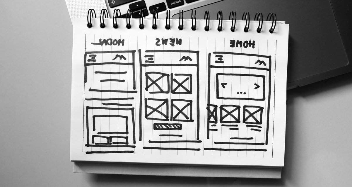
Step 7: Map the Navigation Systems
Your IA will be exposed through several navigation layers. Plan each one deliberately. For the wider picture, see Why is information architecture important to web design.
| System | Where it lives | What it contains |
|---|---|---|
| Global | Header, every page | The 5 to 7 level-1 sections plus one primary CTA |
| Local | Within a section | Sibling pages inside Services, for example |
| Utility | Top bar or header corner | Login, language, phone number, search |
| Contextual | Inside body content | Related pages, in-text links, next steps |
| Footer | Bottom of every page | Legal, secondary pages, full section map |
| Breadcrumbs | Top of level-2 and deeper pages | Path back up the hierarchy |
A good habit: the global menu should carry only what serves the top tasks. Everything else goes in the footer or in contextual links. A menu is not a storage unit.
Validate Before You Design: Tree Testing and First-Click Testing
You can test an IA with zero design work. Write your hierarchy as a plain indented list, hide everything except the top level, and ask a participant: “Where would you click to find out how much a new website costs?”
- Tree testing: participants navigate the text-only hierarchy to complete a task. Measure success rate and whether they had to backtrack.
- First-click testing: measure only the first choice. Research consistently shows that when the first click is correct, task success rates climb dramatically.
Target a success rate above 80% on your top tasks. Below that, the problem is almost always a label, not a layout.
Common Information Architecture Mistakes on Business Sites
- Organising by internal departments instead of customer needs
- Creating a page per keyword variation, which splits authority and confuses visitors
- A homepage that tries to be every page instead of routing people quickly
- Clever labels that nobody searches for or understands
- Orphan pages with no internal links pointing to them
- Letting the CMS decide URLs and discovering it two years later
- Adding pages indefinitely without ever reviewing or pruning

A Worked Example: Local Service Business
Here is a complete, realistic IA for a small business with around 20 pages. Anyone digging further should read A Beginner’s Guide To Information Architecture in UX.
| Level 1 | Level 2 | URL pattern |
|---|---|---|
| Services | Website design, SEO, Maintenance, Hosting | /services/seo/ |
| Work | Case studies by industry | /work/bakery-website/ |
| Pricing | (no children) | /pricing/ |
| About | Team, Process | /about/process/ |
| Blog | Articles | /blog/article-slug/ |
| Contact | (no children) | /contact/ |
Six sections, two levels deep, every commercial page two clicks from home. Clean to build, clean to crawl, clean to extend.
Your Pre-Design Checklist
- Content inventory complete, with an action chosen for every row
- Top 5 user tasks written down and agreed
- Card sort run with at least 5 people from the target audience
- Hierarchy drafted as an indented list, 5 to 7 top-level sections
- No revenue page deeper than level 3
- URL pattern defined for every template type
- Menu labels taken from customer language
- Redirect map prepared for every changed or deleted URL
- Tree test passed with 80%+ success on top tasks
When all nine boxes are ticked, open your design tool. Wireframes built on a validated structure take a fraction of the time, because you already know what each page must contain and where it must link.
FAQ: Information Architecture in Web Design
How long should information architecture take for a small website?
For a site of 10 to 30 pages, budget 3 to 6 hours of focused work spread over a few days, plus an hour for card sorting with participants. For sites above 100 pages or e-commerce catalogues, expect several days and a dedicated tree test.
Do I need special software for card sorting?
No. Index cards on a table work perfectly for in-person sessions and often produce richer insight because you hear people think out loud. Online tools help only when your participants are remote or when you need more than 15 of them.
Is information architecture the same as a sitemap?
No. The sitemap is one deliverable that visualises the IA. Information architecture also covers labelling, grouping logic, metadata, search behaviour and the relationships between pages that a sitemap diagram does not show.
How many items should be in a main navigation menu?
Between 5 and 7 for most business websites, plus one call to action. Beyond that, scanning time increases sharply and visitors start ignoring the menu entirely. Push secondary items to the footer or to contextual links within content.
Does information architecture affect SEO?
Significantly. Your hierarchy determines URL structure, internal link distribution, crawl efficiency and topical grouping. A clean IA concentrates authority on your important pages and prevents several thin pages from competing for the same query.
Can I change my information architecture after launch?
Yes, but it costs more. Any URL change needs a 301 redirect, menus and internal links need updating, and rankings can wobble for a few weeks. This is exactly why structuring on paper before designing is worth the upfront hours.
What if two sections could logically hold the same page?
Pick one canonical home for the page and surface it elsewhere through contextual links, related-content blocks or filters. Duplicating the page at two URLs creates maintenance work and splits your SEO signals.
Final Word
Good information architecture web design is invisible when it works. Visitors do not compliment your menu structure, they simply find what they came for and get in touch. That outcome starts with a spreadsheet, a deck of cards and a willingness to delete pages nobody reads, long before anyone argues about button colours.
If you would like a second opinion on your current site structure, our team runs content audits and IA workshops as a standalone service before any design engagement. Get in touch and we will map your hierarchy with you.